Saora · Version 2.1 · October 2026
Design system
One system behind every Saora artist website. This page renders from the same tokens, components and config that build the sites, so it is a view of the system rather than a copy of it. Open the Personalise panel and the page restyles itself, values and contrast checks included.
01
Principles
Four rules that every token, component and template decision is checked against.
- 1
The artwork supplies the colour.
The interface stays near-monochrome so paintings read true. Colour is reserved for one accent, used sparingly.
- 2
A frame, not a painting.
Type and layout sit beside the work, never on it. No crops, rounded corners, shadows or overlays on artwork.
- 3
Curated choices, not controls.
Artists choose from designed pairings and palettes. Every combination is tested, so no choice can make a site worse.
- 4
The sheet is the source.
Content lives in what the artist owns. Pages, images, metadata and structured data are generated from it.
02
Colour
Six semantic tokens. Components only ever use these names, so a palette is simply a new set of values for them. The values shown are read from this page as it renders.
--paper
Paper · Page ground
--paper-raised
Paper raised · Cards, image wells
--ink
Ink · Primary text
--ink-muted
Ink muted · Captions, meta
--line
Line · Hairlines, dividers
--accent
Accent · Focus, links, active state
--error
Error · Form errors only
The four palettes artists choose from. Each remaps the same tokens:
Gesso
#F6F1E7 · #1C1814 · #B0502B
Limestone
#EFEFED · #141414 · #46605E
Umber
#14120F · #E9E2D6 · #BE9057
Porcelain
#FFFFFF · #101010 · #2F4A8C
03
Type
A fluid modular scale, about 1.2 on phones widening to about 1.333 on desktop, set in one display face and one text face. Sizes are parsed from tokens.css; the face and current size are read live.
--text-display
Artist name, hero
42–104px · lh 1.02
Light on water
--text-4
Page titles
33–54px · lh 1.1
Light on water
--text-3
Series titles
28–40px · lh 1.1
Light on water
--text-2
Section headings
23–30px · lh 1.1
Light on water
--text-1
Lead lines
19–23px · lh 1.5
Painted on location in small formats, returning to the same harbours across seasons.
--text-0
Body
16–17px · lh 1.6
Painted on location in small formats, returning to the same harbours across seasons.
--text--1
Meta, captions, labels
13–14px · lh 1.5
Painted on location in small formats, returning to the same harbours across seasons.
Four pairings, switched by one attribute on <html>:
White Cube
Schibsted Grotesk + Inter
Contemporary, gallery white walls
Print Room
Fraunces + Hanken Grotesk
Warm, editorial
Reading Room
Newsreader + Archivo
Literary, quiet
Catalogue
Bodoni Moda + Lora
Classical, auction catalogue
04
Spacing
An 8px-based scale for components. Page rhythm uses two fluid tokens instead, covered under Layout.
--space-1
4px
--space-2
8px
--space-3
16px
--space-4
24px
--space-5
40px
--space-6
64px
--space-7
96px
--space-8
144px
05
Layout
Twelve columns on desktop, one on phones. Spacing between sections and at the page edges breathes with the viewport rather than jumping at breakpoints.
--gutter
Page edges · 20–56px
--space-section
Between sections · 96–200px
48–58ch
Reading measure for bios and statements
12 columns
Collection, About and work grids
Breakpoints, widest first:
980px
Side rail and work pages fold into a single column.
860px
Twelve-column layouts collapse to one column. The most used breakpoint.
720px
The Personalise panel docks to a pill at the foot of the screen.
640px
Phone: header, hero and grids tighten their spacing and tracking.
06
Components
Live instances, not screenshots. The cards are the real component fed by the demo data; the fields and button use the production form styles in form.css. Header, footer, exhibitions and the contact form are on view across the live demo.
WorkCard. Hover lifts the image 2%; sold works carry a dot and a word:
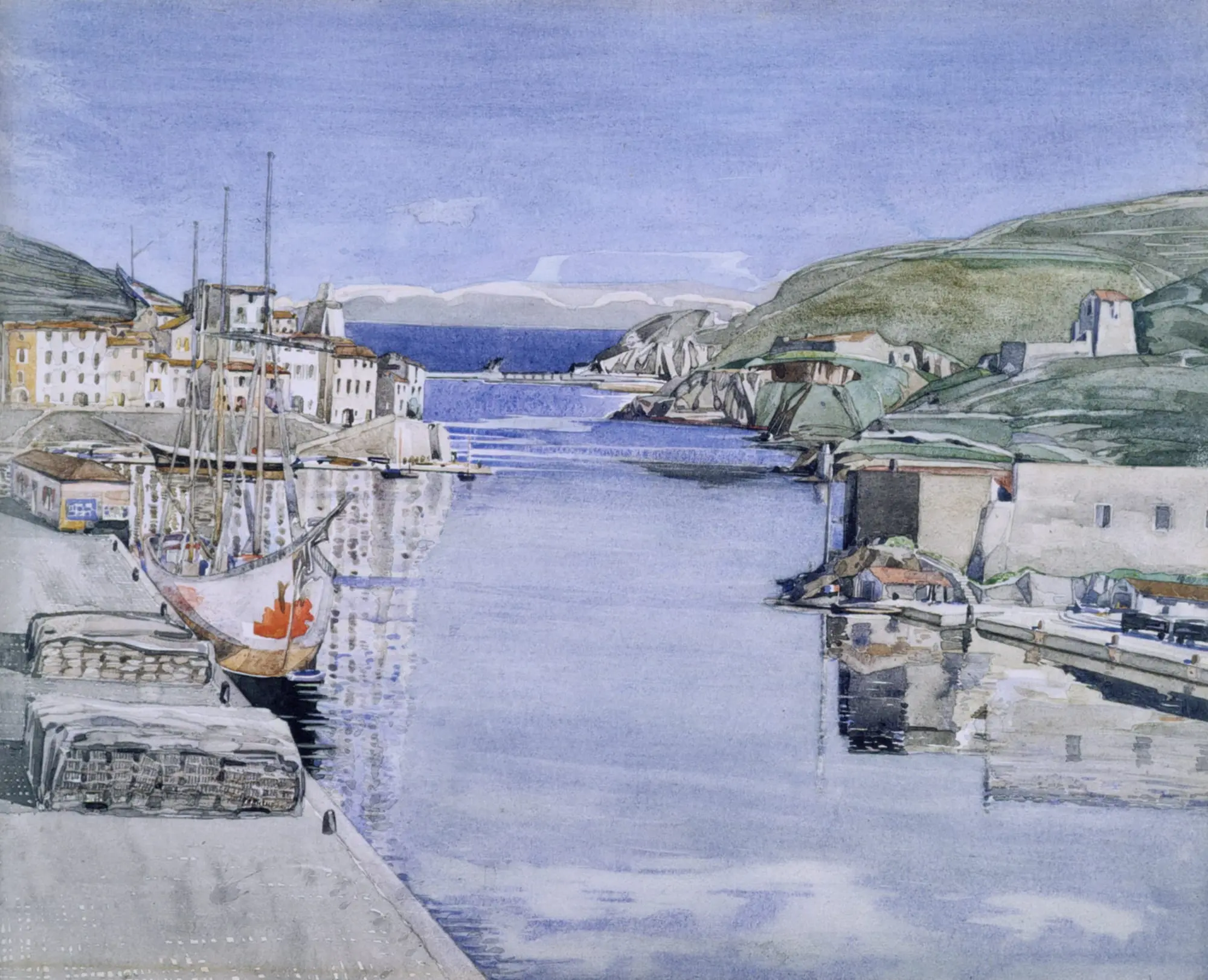
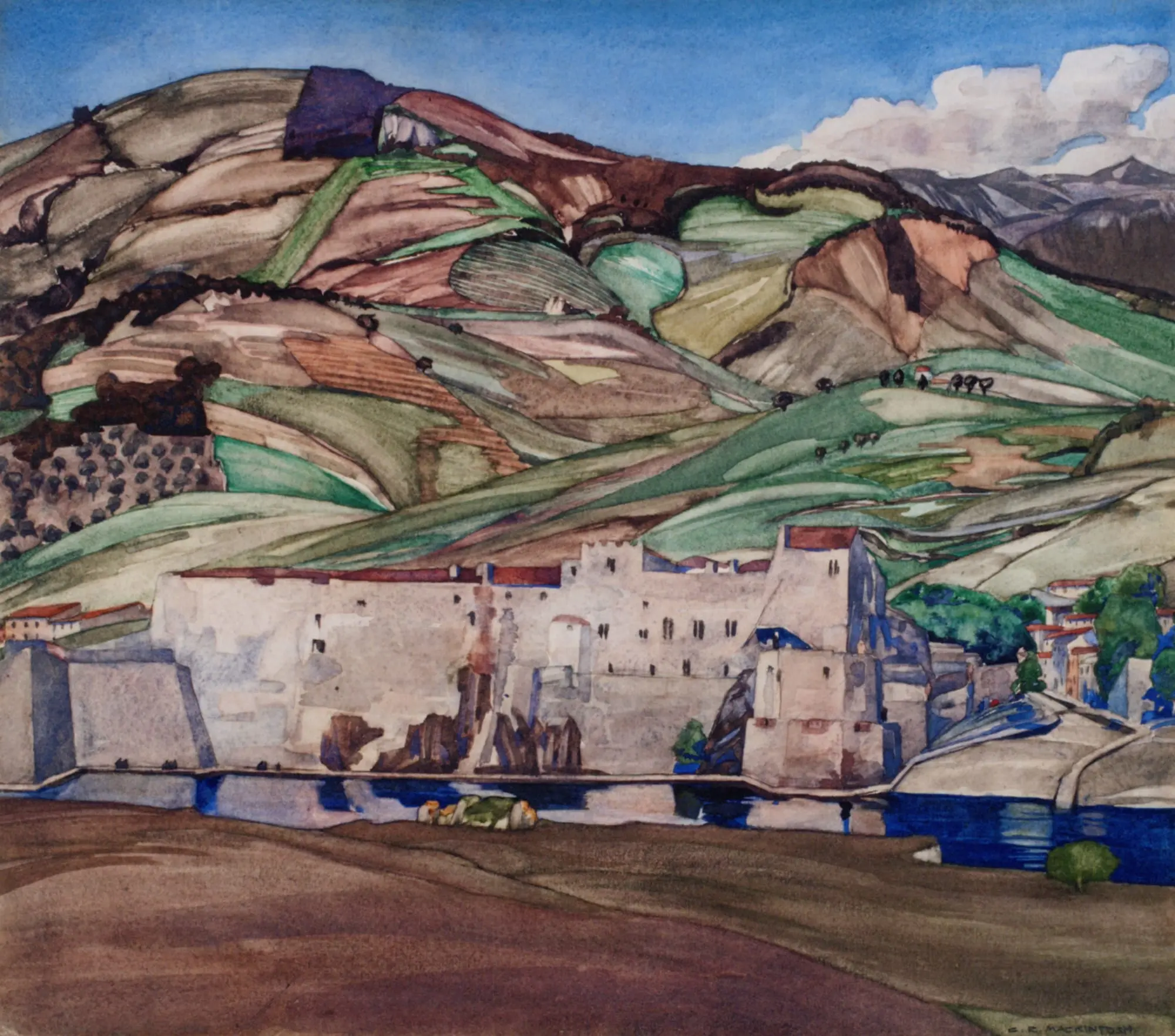
Field states:
Default
Focus
Filled
Error
Send button states:
Default
Hover
Keyboard focus
Sending
Work status, and where it shows:
| Status | On the card | On the work page |
|---|---|---|
| Available | No marker. The work speaks first. | Price from the sheet, plus an enquire link. |
| Sold | Accent dot plus the word Sold, never colour alone. | Sold, with the price hidden. |
| Price on application | No marker. | Status poa, or a blank price, renders "Price on application". |
| Not for sale | No marker. | Not for sale, and no enquire link. |
07
Accessibility
Contrast is checked against WCAG 2.2 for every text pairing in every palette. The panel below measures the look on screen right now, so it changes when you switch palette.
The current look, measured live:
Ink on paper
Body text, headings
Muted on paper
Captions, meta, labels
Muted on raised
Text on cards and wells
Accent on paper
Links, focus, active
Error on paper
Field errors
Paper on ink
Send button
Paper on accent
Send button, hover
Every palette, checked at build (lowest ratio 4.55:1):
| Palette | Ink on paper | Muted on paper | Muted on raised | Accent on paper | Error on paper | Paper on ink | Paper on accent |
|---|---|---|---|---|---|---|---|
| Gesso | 15.67AAA | 4.96AA | 4.55AA | 4.63AA | 5.84AA | 15.67AAA | 4.63AA |
| Limestone | 16.00AAA | 4.99AA | 4.59AA | 5.89AA | 5.71AA | 16.00AAA | 5.89AA |
| Umber | 14.53AAA | 6.36AA | 5.89AA | 6.51AA | 10.68AAA | 14.53AAA | 6.51AA |
| Porcelain | 19.03AAA | 5.10AA | 4.63AA | 8.47AAA | 6.57AA | 19.03AAA | 8.47AAA |
Built in, on every site:
Focus
A 2px accent outline, offset 3px, on :focus-visible only, so mouse users never see it and keyboard users always do.
Skip link
The first tab stop jumps past the navigation to the main content.
Reduced motion
With prefers-reduced-motion set, smooth scrolling, reveals and page morphs are switched off and content is simply there.
Forms
Every field has a visible label. Errors have their own colour, separate from the focus accent, a heavier underline and a written message, are announced politely and set aria-invalid.
Images
Alt text is generated from title, year and medium, so no artwork ships without a description.
Status
Sold is a dot and a word. Navigation marks the current page with an underline as well as a colour change.
08
Motion
Slow, settled and never in the way of the work. One curve and one duration cover almost everything.
--ease
cubic-bezier(0.22, 0.61, 0.36, 1)
--speed
0.45s
Press to run a move on the token curve.
Page morph
A work grows from its card into its page with a view transition, 0.45s on --ease.
Reveals
Content rises 28px and fades in over 0.9s as it enters, staggered 0.08s.
Hover
Images lift 2% over 0.7s; text colour shifts over --speed.
Scroll
Lenis smooth scrolling, light enough that the page still feels native.
Reduced motion
All of the above are off. Nothing is hidden waiting for an animation that will not run.
09
Theming
How an artist's choice becomes a styled site. Components never know which look they are in; they only read tokens.
The artist picks a look
In Saora Studio: one pairing, one palette.
The build reads it
prepare-site.mjsmerges it with the site's settings file.Two hooks on <html>
A pairing attribute and the palette's colour values. On this page right now:
data-pairing
Semantic tokens
--paper--ink--accent--font-displayand the rest take their values.Components
WorkCard, Header, ContactForm and every layout render in the look.
On the demos, the Personalise panel rewrites the same two hooks in the browser. That is why this page restyles itself, and why a shared link reproduces a look exactly.
10
Usage and voice
The rules that keep a site looking like a gallery, and sounding like the artist.
Do
Use the accent for one job at a time: focus, the active nav item, a sold dot, a hover. Errors use their own colour.
Don’t
Use the accent for large fills, backgrounds or decoration.
Do
Show every work at its own proportions, on paper-raised if it needs a well.
Don’t
Crop, round, shadow or overlay text on an artwork.
Do
Add a new look by designing a pairing or palette that remaps the existing tokens.
Don’t
Hard-code a colour or font in a component. Everything themeable is a token.
Words, in the artist's world:
| Say | Not |
|---|---|
| Works, series, enquire | Products, collections, buy now |
| Price on application | Contact for price |
| Sold | Out of stock |
| Name replies personally | Our team will get back to you |
11
The content contract
The artist owns a sheet. Each column maps onto one field of the typed Artwork contract in artworks.ts, the only module that knows where data comes from. Everything downstream is generated.
| Sheet column | Field | Where it surfaces |
|---|---|---|
| Title | title | Work page heading · browser tab · og:title · JSON-LD name |
| Year | year | Caption meta line · JSON-LD dateCreated |
| Medium | medium | Caption and work page details · image alt text · JSON-LD artMedium |
| Dimensions | dimensions | Work page details |
| Price | price | Price line. Blank renders "Price on application" |
| Status | status | Sold dot on cards · price line logic (available, sold, poa, nfs) |
| Series | series | Series grouping and pages · prev/next stays inside the series |
| Description | description | Work page text · meta description |
| Order | order | Sort position within its series |
| Image file | image | 4 widths (480 to 1600) and modern formats at build · og:image · lightbox |
12
What the build automates
Quality nobody has to remember. The pipeline enforces it on every build.
Responsive images
Sharp at build: widths 480, 800, 1200 and 1600, sizes per layout, lazy below the fold, intrinsic dimensions so nothing shifts.
Structured data
VisualArtwork JSON-LD generated for every work page from the same data.
Meta and sharing
Titles, descriptions, canonical URLs and og:image derived from config and artwork data.
Sitemap and robots
@astrojs/sitemap and a generated robots.txt pointing at it, on every build.
Favicon
An SVG generated from the artist’s initial in their own palette.
Site language
Every built-in label flows through one dictionary, English or Spanish, set in config.
13
Changelog
The system is maintained, not finished.
2.1Oct 2026
Principles, component states, live accessibility checks, motion, layout and usage documented. Form fields and the send button became shared primitives. Errors got their own colour, separate from focus. Limestone’s muted ink darkened to pass AA everywhere. Folio template added.
2.0Sep 2026
One engine for every Saora site. Looks and content come from Saora Studio, so a template is a setting, not a copy of the code.
1.1Aug 2026
The design system published as a live page.
1.0Jul 2026
Tokens, four type pairings and four palettes, switchable through the Personalise panel.